Hero Image Color
The theme can automatically extract dominant colors from the homepage hero image and dynamically apply them to multiple visual areas of the site.
Default Behavior (heroImageColor: false)
heroImageColor defaults to false, in which case the theme uses the built-in purple-cyan brand colors:
- Hero background glow — uses VitePress default purple-cyan gradient
- Hero title gradient —
linear-gradient(120deg, #bd34fe, #41d1ff) - Code block beam borders — CSS variables
--fx-beam-c1: 189, 52, 254(purple),--fx-beam-c2: 65, 209, 255(cyan)
Enable
Set heroImageColor: true in themeConfig:
// .vitepress/config.mts
import { defineConfigWithTheme } from "vitepress"
import fxConfig from "@fuxishi/vitepress-theme/config"
import type { FxThemeConfig } from "@fuxishi/vitepress-theme/config"

export default defineConfigWithTheme<FxThemeConfig>({
  extends: fxConfig,
  themeConfig: {
    heroImageColor: true,
  },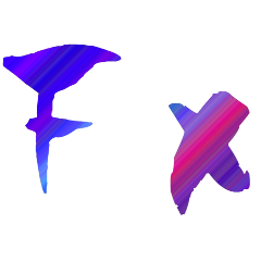
})No need to manually configure image paths — the theme automatically reads hero.image from the homepage frontmatter:
---
layout: home
hero:
  image:
    light: /hero-light.png
    dark: /hero-dark.png
---Color Application Areas
The extracted colors are automatically applied to the following areas:
| Area | Description |
|---|---|
| Hero background glow | Extracts all hues sorted by order, builds a conic-gradient |
| Hero title gradient | Picks two colors with the largest hue difference, builds a linear-gradient text gradient |
| Code block beam border | Dynamically overrides beam colors via --fx-beam-c1 / --fx-beam-c2 CSS variables |
| Navigation beam border | Same colors used for hover beam rotation border |
| Music ball | Progress ring gradient, orbit ring, play glow, slider colors sync accordingly |
Light / Dark Mode
The theme extracts colors separately from the corresponding mode images:
- Light mode → from
hero.image.light - Dark mode → from
hero.image.dark
If only one image is configured, both modes share the same color set.
Caching
Extracted colors are cached in the browser's localStorage to avoid recalculating on every visit:
- Cache key:
fx-hero-colors - Stored separately per light/dark mode
- Auto-invalidation: The cache records the source image path. On page load, the current image path is compared against the cached path — if they differ, the old cache is cleared and colors are re-extracted
- Mode switching restores colors from cache instantly
How It Works
The theme uses node-vibrant to extract 6 dominant colors (Vibrant, DarkVibrant, LightVibrant, Muted, DarkMuted, LightMuted) and builds gradients based on hue information.
Color extraction is done client-side via the FxHeroImageBg component — no Node.js file system access required.